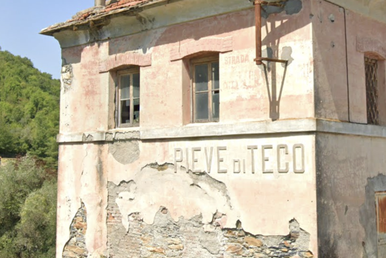
It’s one of the first things you see upon coming into Pieve di Teco from the south – a old ruin with the name of the city on it. You can’t really miss it. But if you’re in advertising like I am, and geek out on all sorts of design, you might be extra enthralled.
The typeface is fascinating to me. The san serif font is something I’ve never seen before – and it’s all around. Several city buildings have the font on them and the neighboring town of Acquetico uses it, too. I’m sure there are other examples around we have yet to find.
But in searching for it, I couldn’t find it anywhere. Paging through typeface libraries got me nowhere. Some historical research didn’t turn up anything either. I got shrugs from designers I know. Then the amazing iPhone app “What the Font?” served up a bunch of options… and that got me close.
A typeface called “Cosmic Lager” is as similar as I’ve gotten. It’s obviously a heavier weight than the original, and some of the letters are not right, but it’s 90% of the way there and could make do in a pinch.

I’m still hunting for the exact typeface though. I have some cool ideas for ways to use it in our renovation and I want to get it right. If anyone has any leads on what the typeface might be, or if any type designers want to re-create it, drop this font dork an email.


Comments are closed.